Reimagining
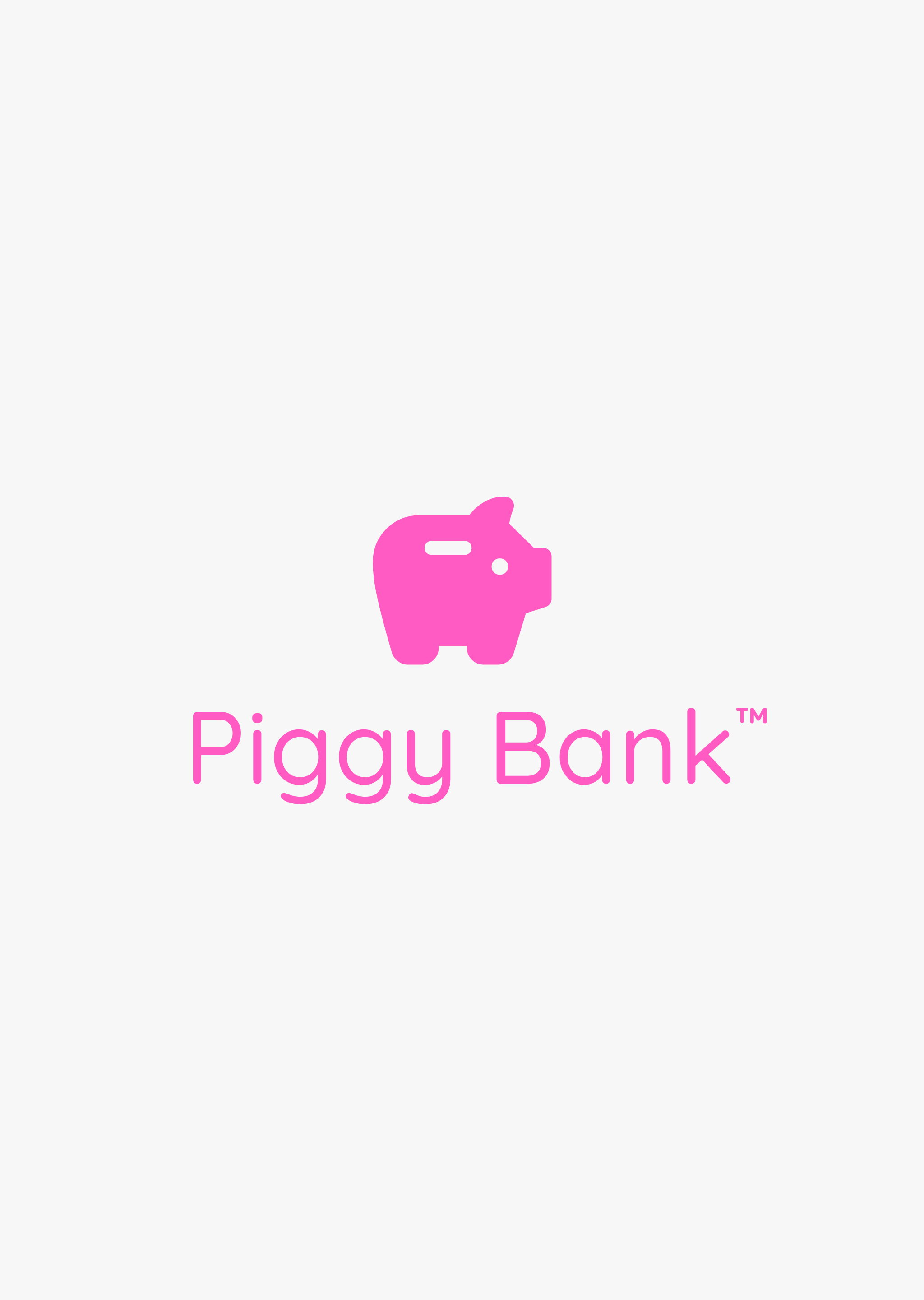
PiggyBank™
the Modern Bank on Android.
Professional Certificate in UI Design
UX Design Institute Case Study

Discovery
Our first interaction with money starts as a child, saving using a piggy bank, and as we venture into adulthood we interact with complex banking experiences. These experiences can vary from bank to bank.
There are tons of opportunity to create an intuitive banking experience highlighting key tools to authorise payments, to check pending transactions.

My role
We were tasked to reimagine a banking app UI. Using basic UX wireframes, we had to create a design system & build a prototype.
UI Designer

ToolKit
Figma
Material Design

Affinity Designer
Brand Qualities
Playful
Trustworthy
Clear
Brand Identity
As we are designing for Android, I stumbled across the Savings (Piggy Bank) symbol within Material Design resources. I felt that this aligned with the brand quality — Playful and the discovery story.
Design System
The design system includes a range of elements from colours to symbols. I chose colours which connected with the brand qualities — Pink is Playful, & Blue for Trustworthy.
Colour Palette
Primary

Secondary
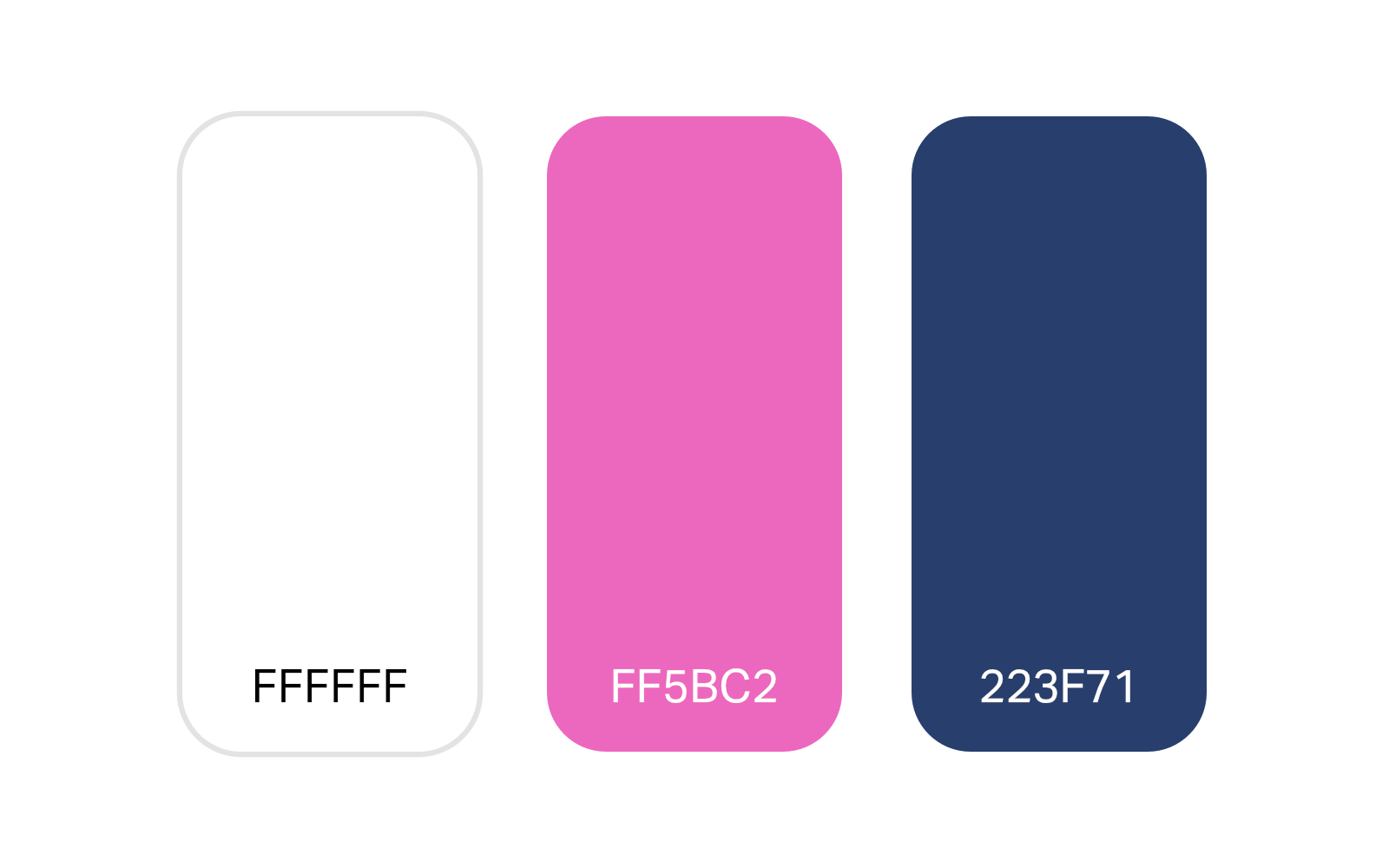
Accent

Buttons & Toggles

Symbols

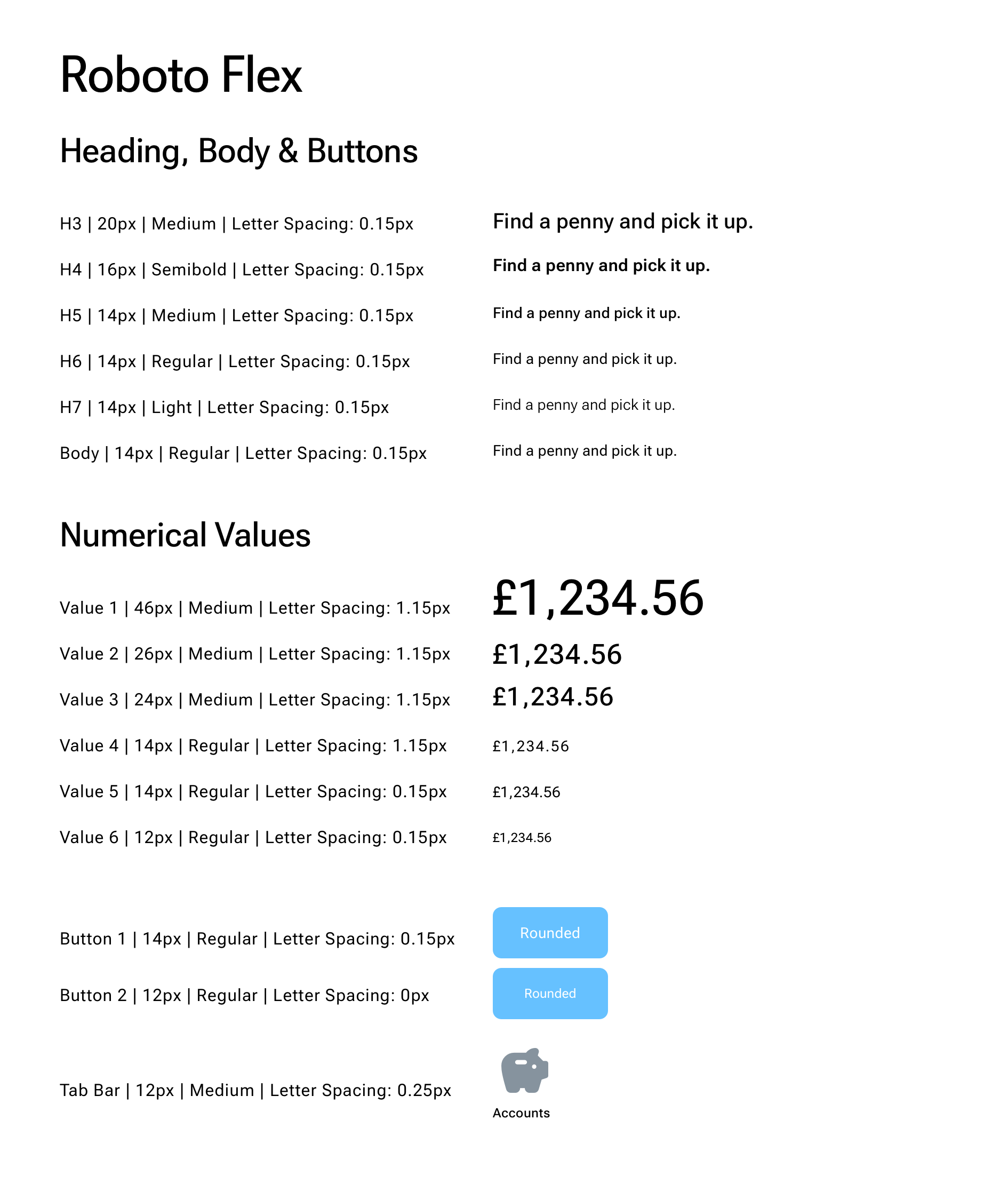
Typographic Scale

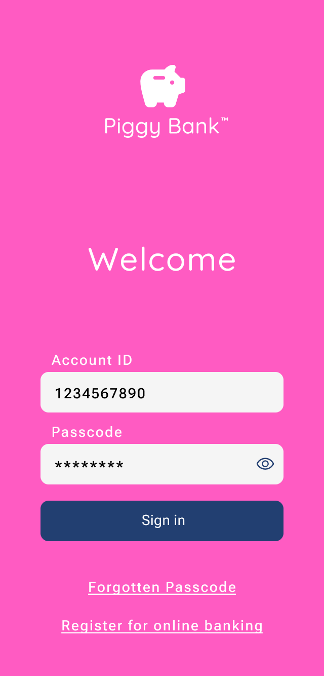
Hi-Fidelity Designs
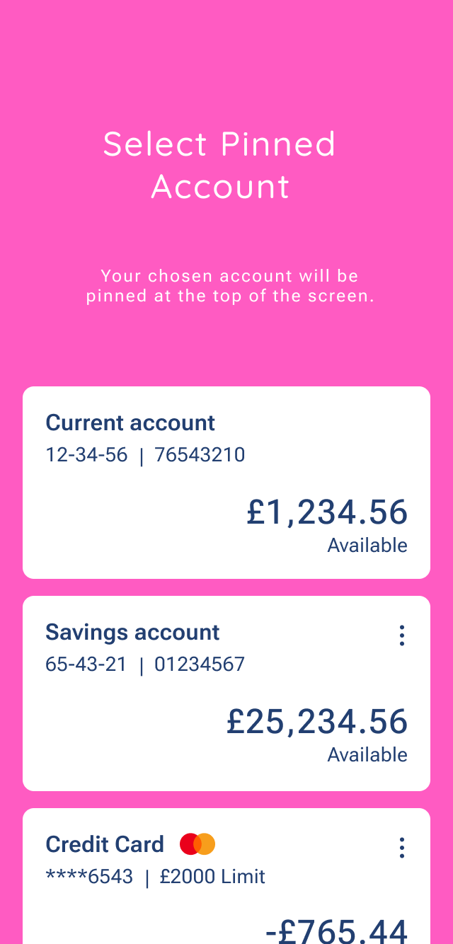
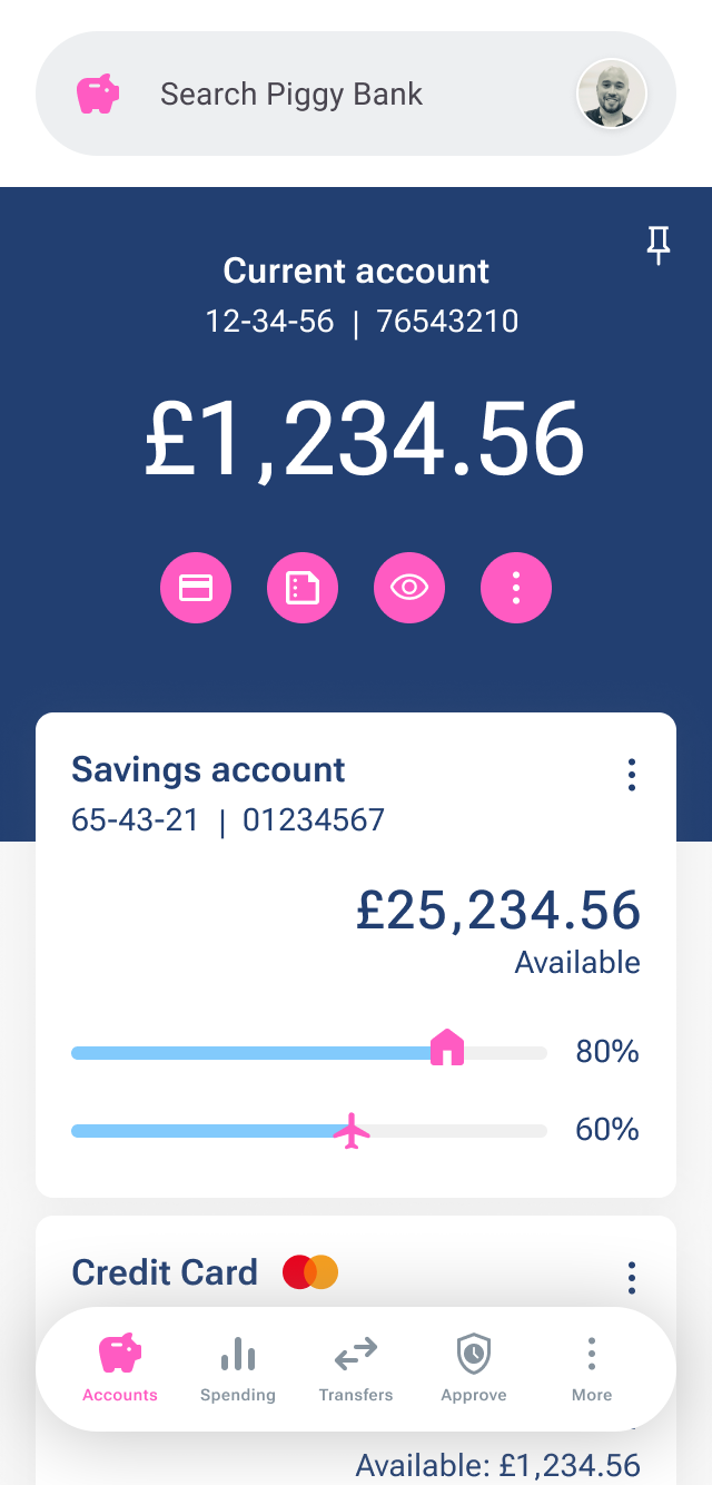
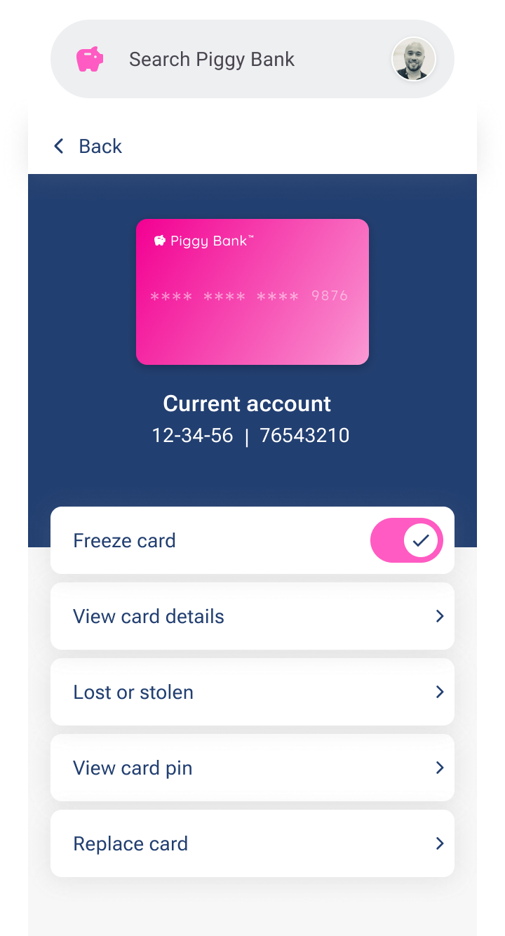
A carousel with a collection of screen states — Sign In, Select Pinned Account, Accounts, & Card Management.
Prototype
An interactive Figma prototype starting with a loading screen. You can navigate to bank accounts, spending and card management
Outcome
I validated designs and prototypes, with my peers and the course UX mentors using Slack. Gaining a Professional Certificate in UI Design.
There were several opportunities to revisit some screen states. So, since the course ended, I redesigned the app creating a 2.0 version & updated the design system, increasing affordances.