
Widgets
on Apple’s iOS platform
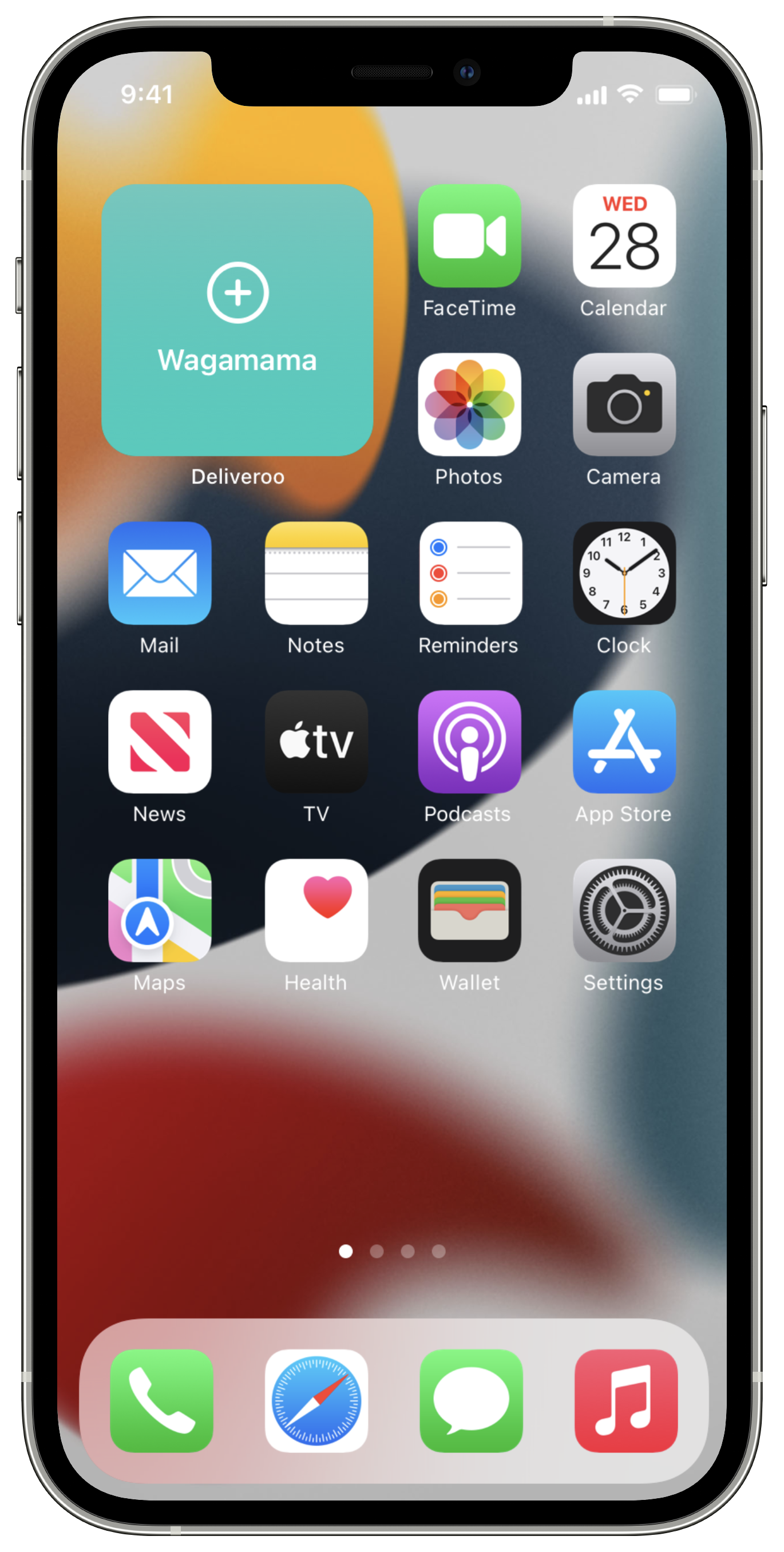
deliveroo
Design Challenge for Apple Service Academy

My role
Product Designer
I applied for a Product Designer role within the Apple Services Academy. I was challenged to design a Widget for iOS. We were given three options to choose from — Deliveroo, AirBnb & NHS COVID 19. I chose Deliveroo as I am familiar with their service and iOS app. I completed the project in 3.5 days out of 7 due to technical challenges.


Deliveroo is passionate about food and bringing people evermore choice.


Audience
The audience will be anyone who wishes to discover new food, ordering a takeaway, making their weekly food shop to catering for an event or party. Demographic ranges from anyone who is 16 years and up (as they would more than likely have a bank account with a debit card) excluding restricted items.


Opportunities

Highlight Status
Highlight the order status, building trust and transparency.

Personalisation
We could increase engagement & streamline the ordering journey, with personalised buttons of favourite restaurants.
Widget Technology

“For a widget the user frequently views, a daily budget typically includes from 40 to 70 refreshes.”
Proposed Solutions

Order Status
We can highlight a current order that’s been processed to when a rider is on its way. Alternatively, when an order hasn’t been made, we could show a screen to encourage ordering.

Favourites
To increase engagement & streamline the ordering journey, we could create a collection of widgets, with personalised buttons to a customer’s favourite restaurants.
UI design & Prototyping
I used Sketch app to create the user interface screen states. I then imported the artboards into Principle for Mac, adding the emotion & behaviours, building an interacting prototype.

Asset Creation
I used Affinity Designer & Adobe Illustrator to create icons that don’t exist. I used Apple’s SF Symbols for app iconography.

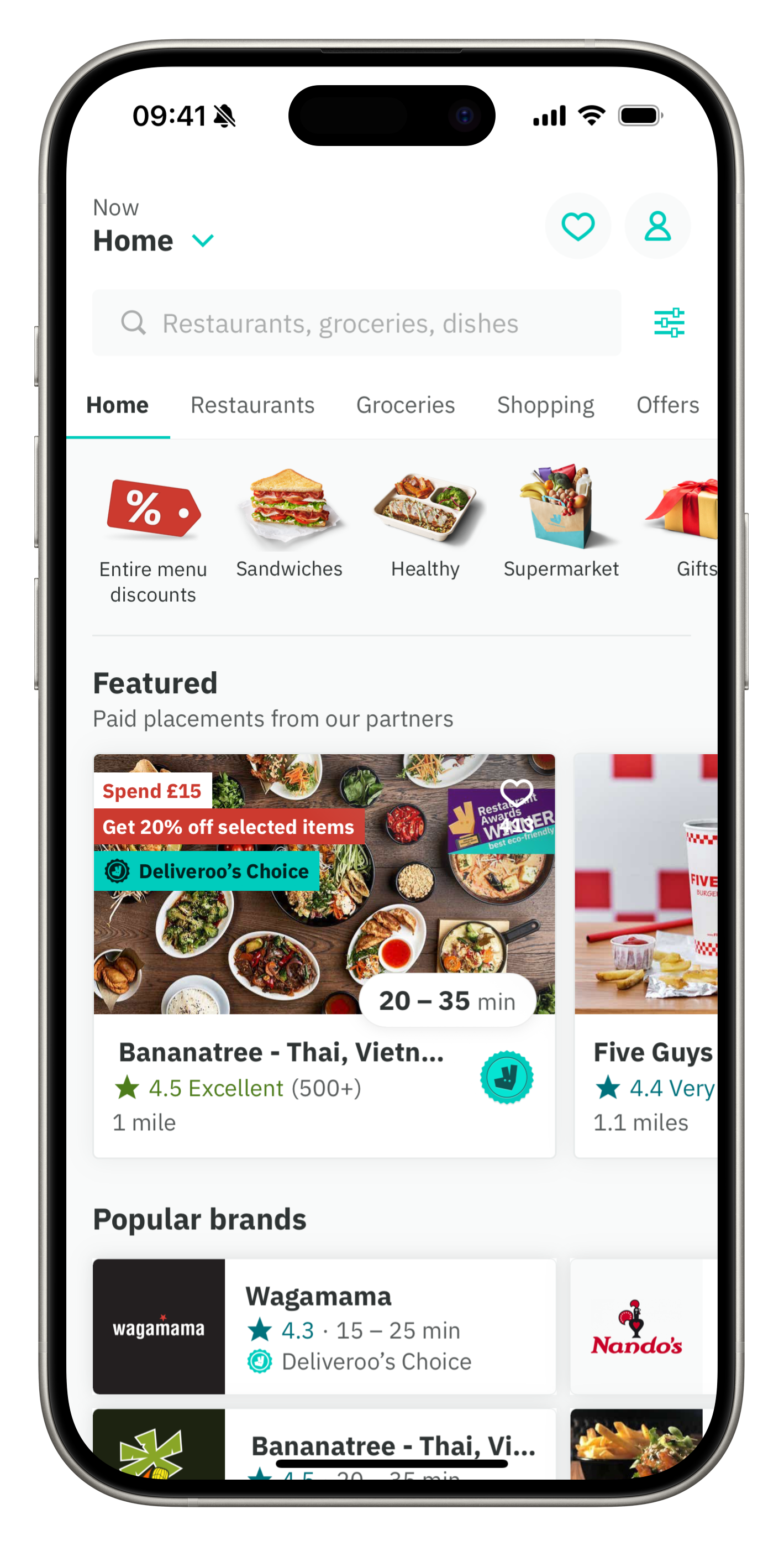
deliveroo app

I used the deliveroo design assets, iconography and colour palette to align the widgets with their design system. Building a connection and familiarity. I used the iOS system font which SF (San Fransisco).
Colour Palette
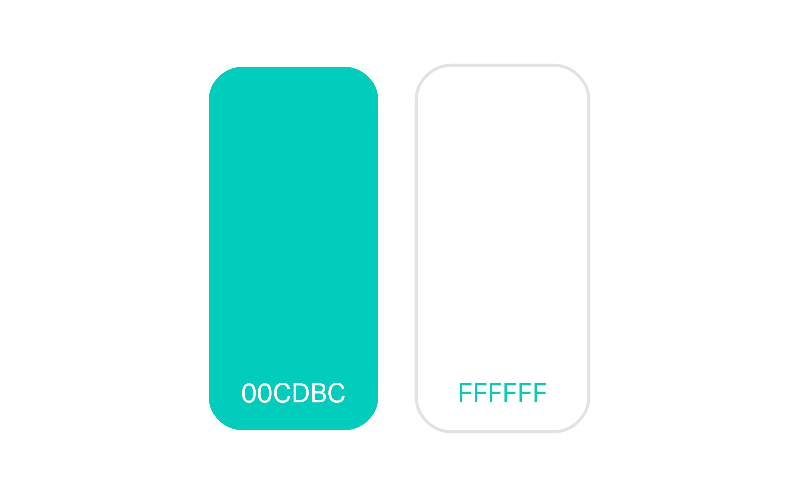
Primary

Accent
Widget Design
Order Status

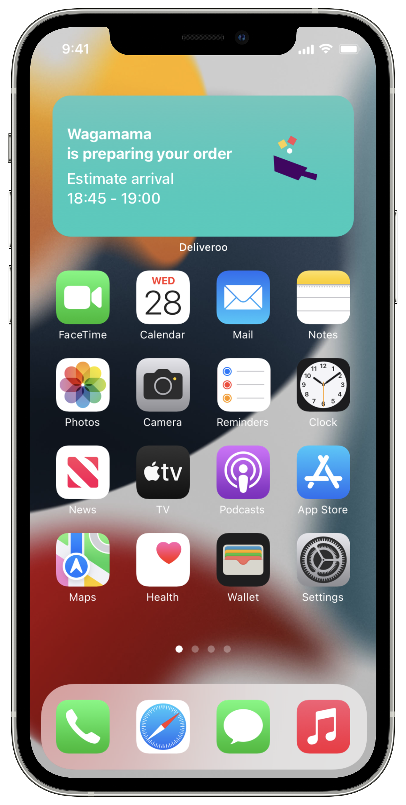
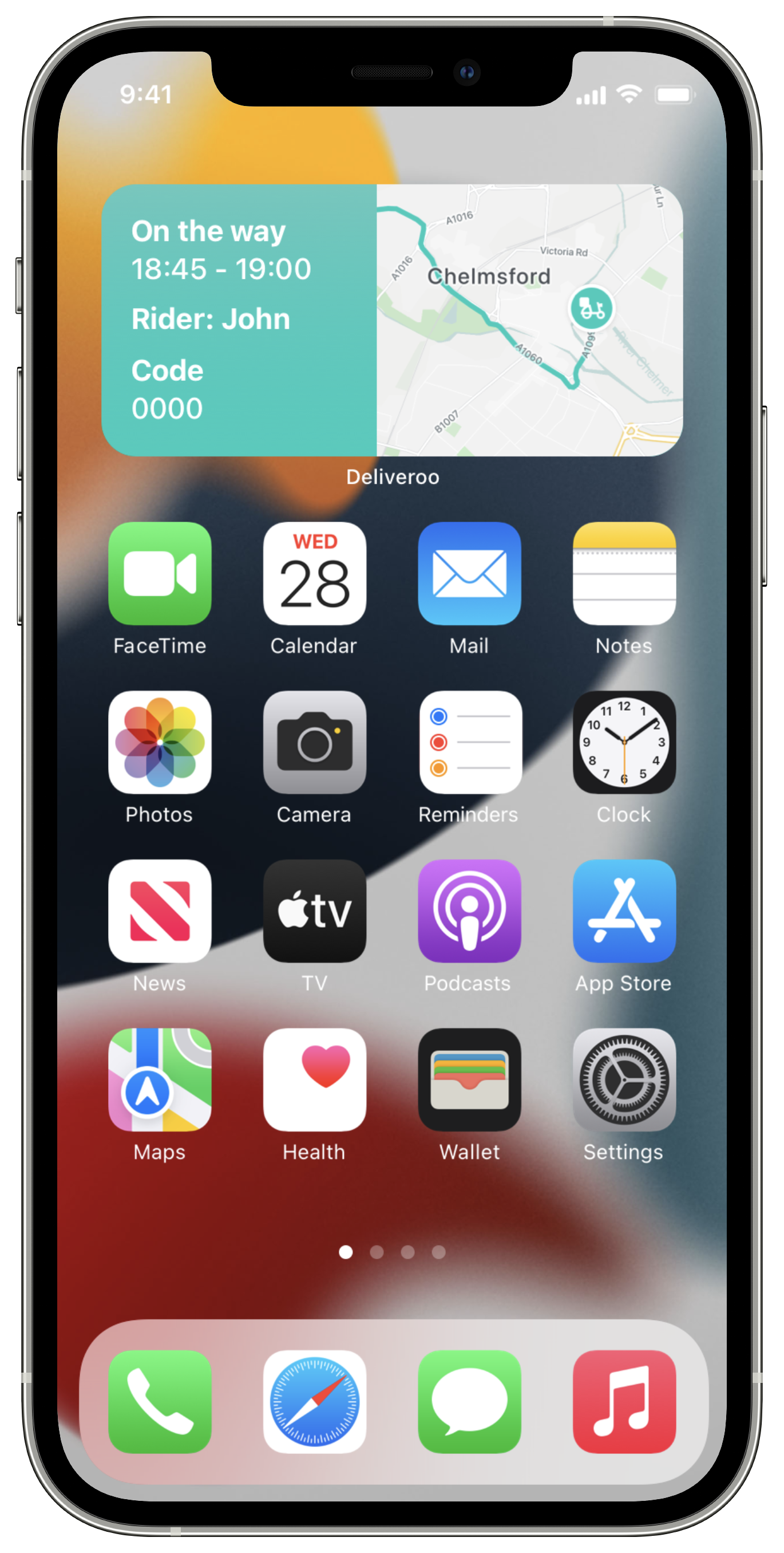

Widget Design
Favorite Restaurants


Outcome
Sadly I wasn’t successful for the role, however I am proud of the work I created, therefore I have chosen to share this project within my portfolio.
If I was to revisit this project, I could merge both widgets creating a single experience. And, we could go even further with a Favourite Meal or items widget.